Comera Pay · Mobile wallet
A WALLET FOR
COMPLEX TRANSACTIONS.
I designed the product so people can understand the amount, conditions and status before, during and after a transaction.
The product
A wallet built around real financial complexity.
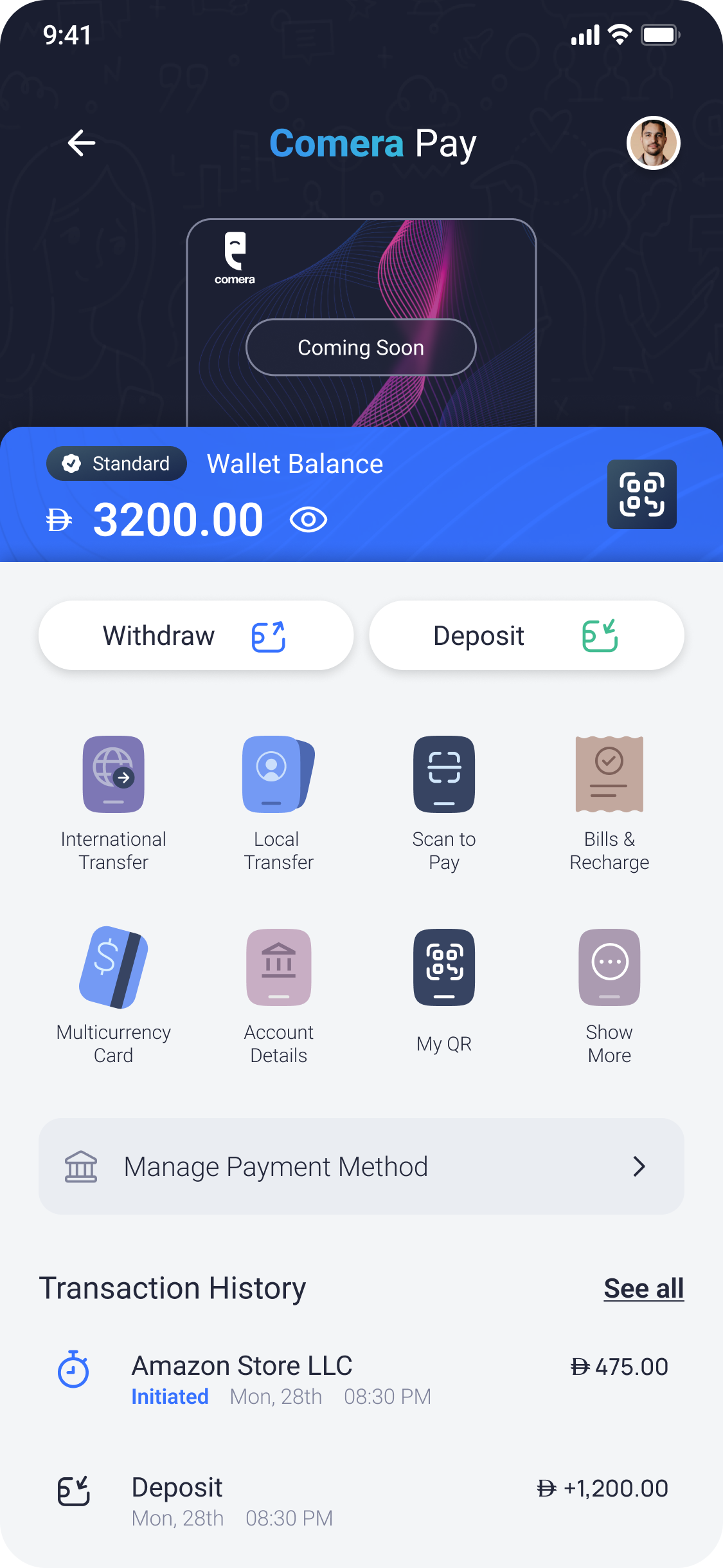
Comera Pay supports transfers, deposits, withdrawals, bill payments, wallet tiers, account management, and other financial services.
I designed the product as part of my work at Avrioc Technologies, working independently across UX/UI and taking responsibility for major interaction and experience decisions.
My work covered transaction logic, information hierarchy, system states, recovery paths, contextual guidance, and the words people rely on to understand what their money is doing.
The information model
At each stage, answer
three practical questions.
Reveal the information that can change the user’s decision.
Describe system progress without inventing certainty.
Confirm the real outcome and keep the next action visible.
Clarity before commitment
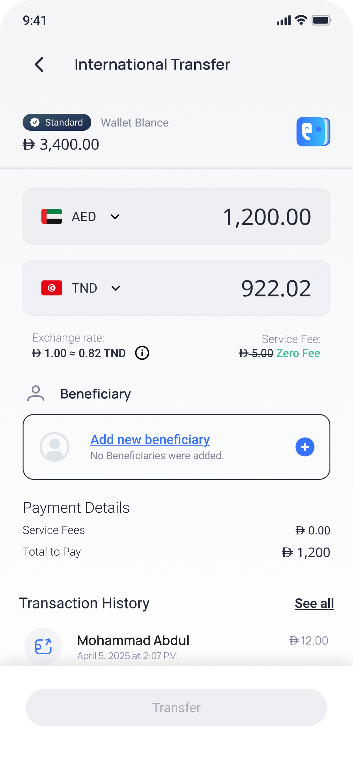
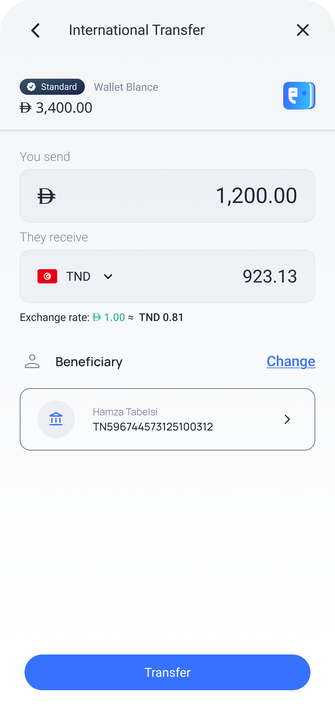
Put the transaction details beside the final action.
As the user approaches confirmation, the interface shows more specific information.
Amount, destination, beneficiary, exchange rate, fees and payment method are grouped around the confirmation so the user can check them together.
- Amount being sent
- Amount being received
- Beneficiary and destination
- Exchange rate and service fee
Transaction modes
Local and international transfers need different information.
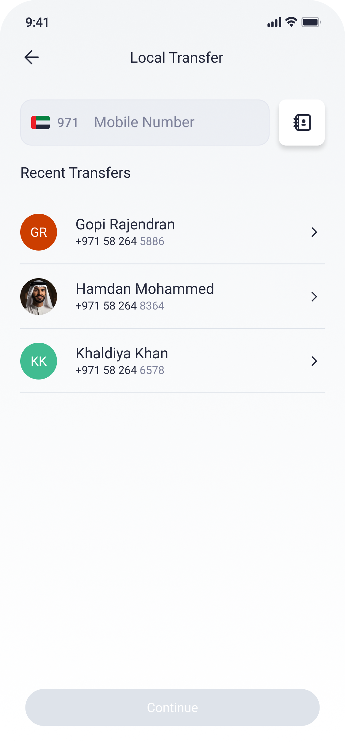
Use familiar recipients.
Phone numbers, contacts and recent recipients reduce the steps needed for a common local transfer.
Show the additional conditions.
Currency conversion, fulfilment method, beneficiary details and operational status receive more space because they can change the decision.
Preventing avoidable failures
Show the constraint
where it can be corrected.
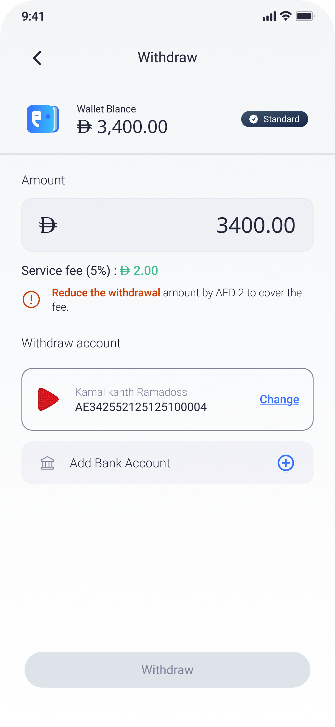
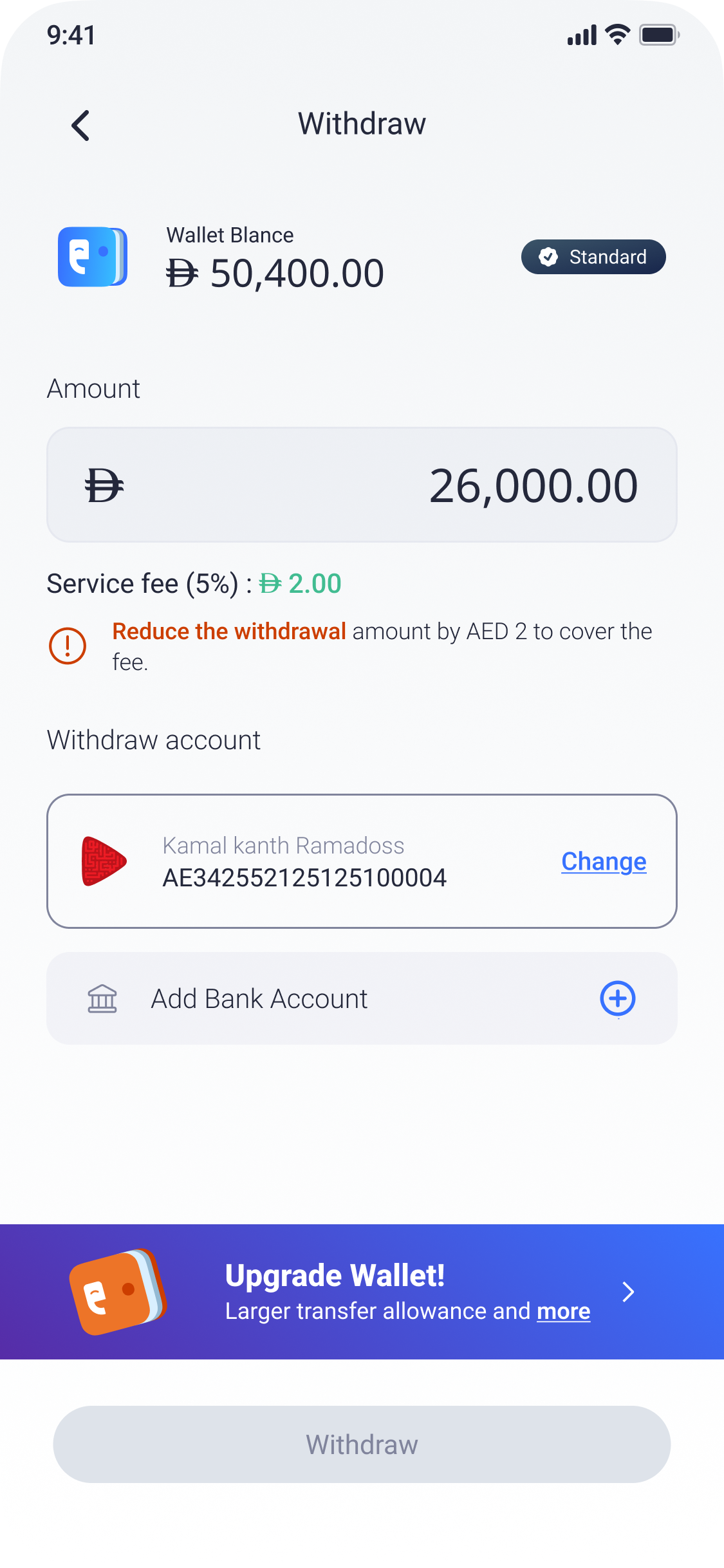
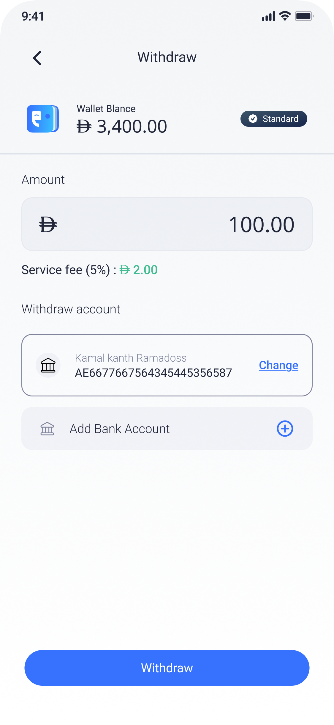
The interface names the fee or limit affecting the transaction.
Users see how to adjust the amount before submission.
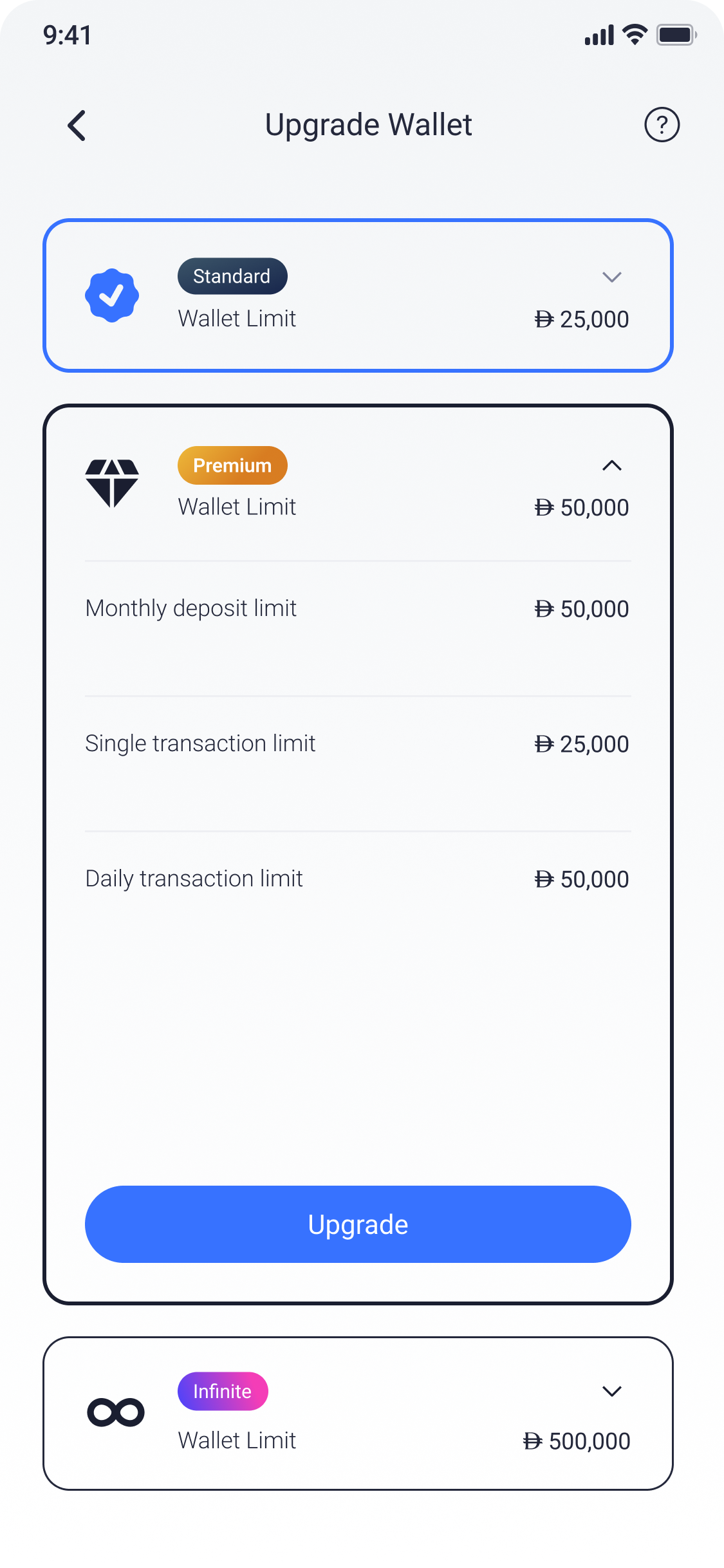
Wallet upgrade appears when the current tier becomes the actual blocker.
Contextual product guidance
Offer an upgrade when a limit affects the task.
Wallet-tier messages appear in context instead of occupying the product continuously.
When the current tier blocks a transaction, the interface explains the limit first and then offers the relevant upgrade path.
Guidance appears at the point where it can help the user continue.
Transaction progress
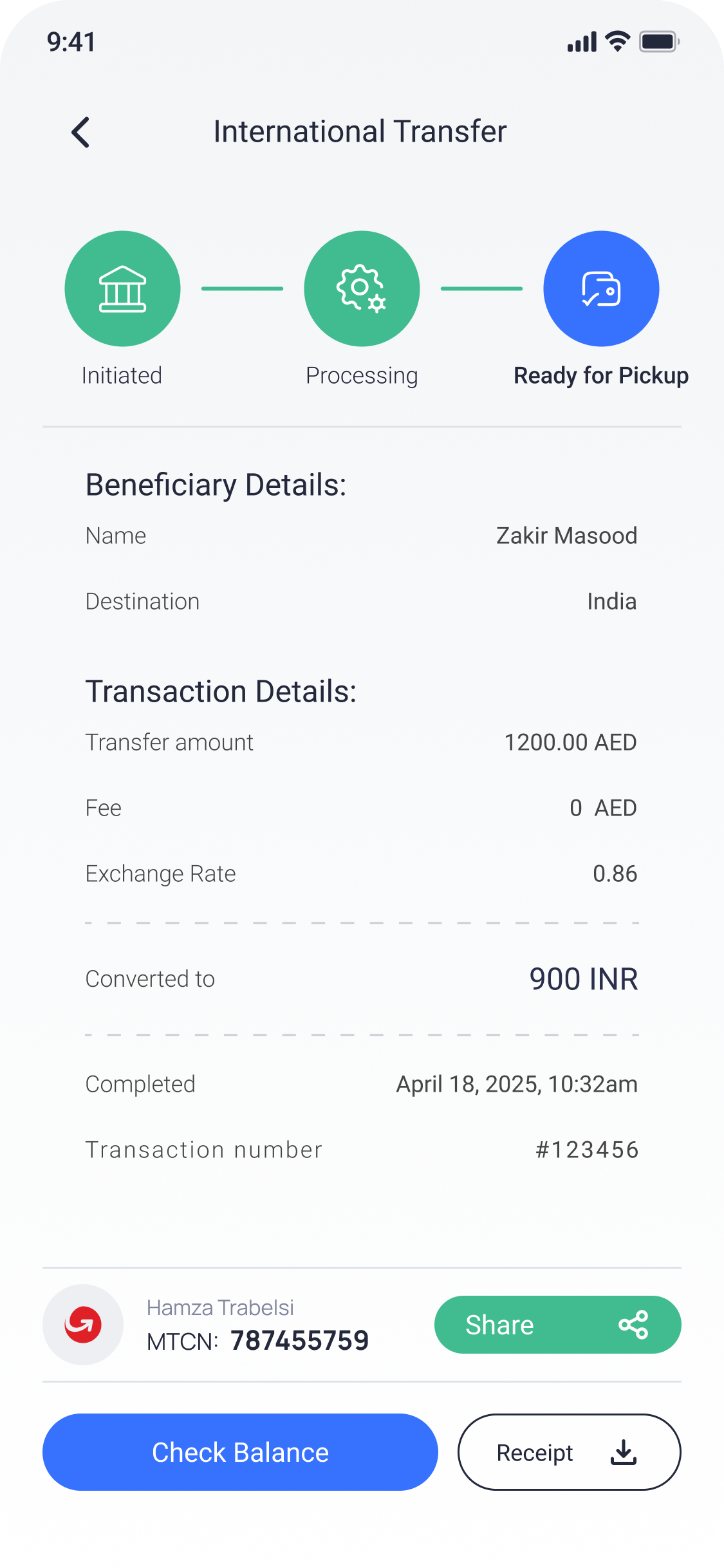
Each status has
a specific meaning.
The request exists.
The system is working.
The recipient can act.
The transaction is final.
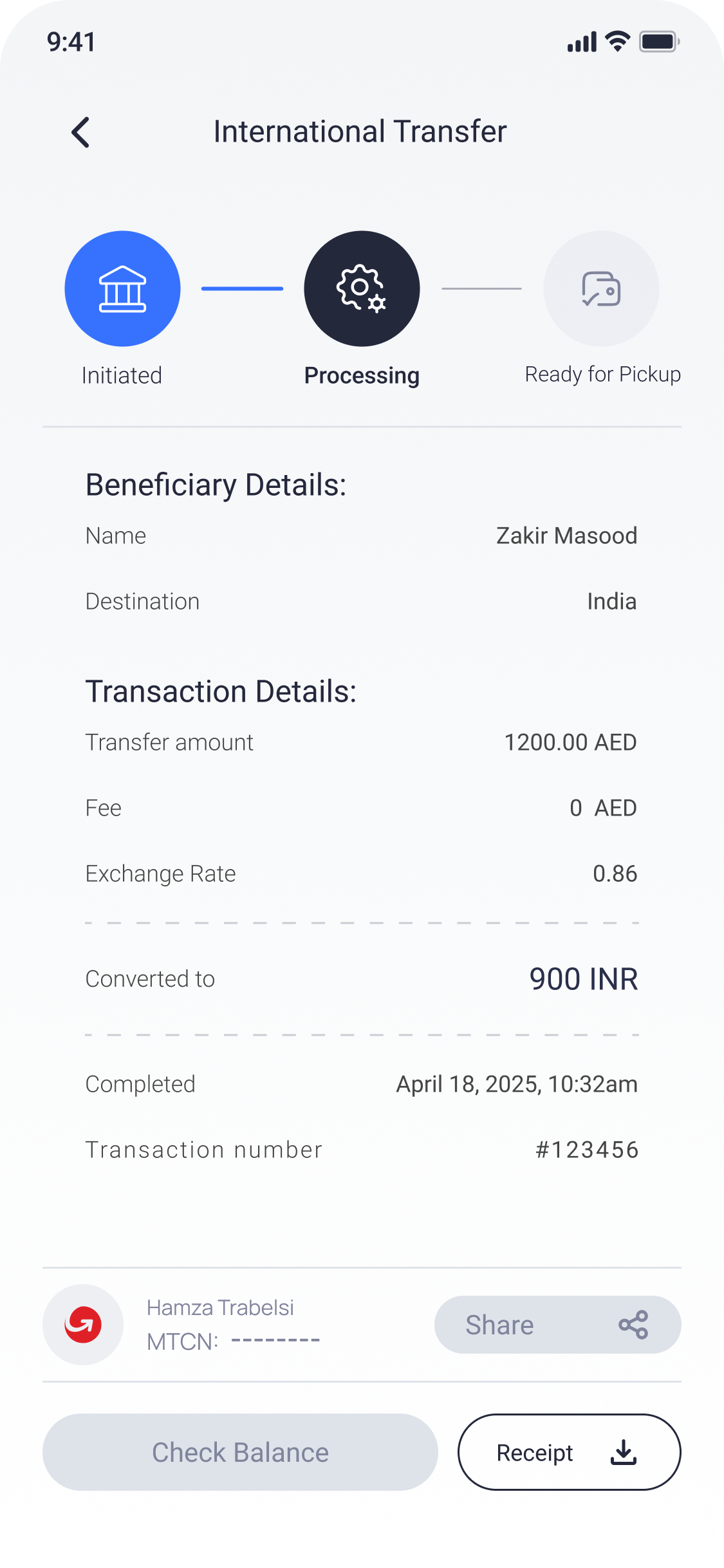
A generic “successful” state would communicate more certainty than the underlying transaction supports.
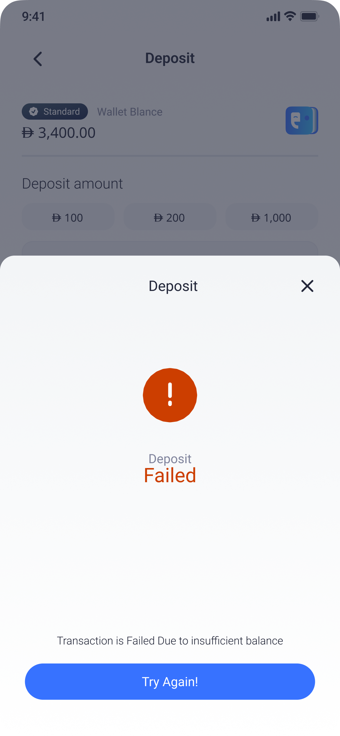
Failure and recovery
Explain the failure and the next step.
When the product cannot prevent a problem, it needs to help the user recover from it.
Keep the user oriented.
Use the most specific information available.
Retry, correct, or choose another route.
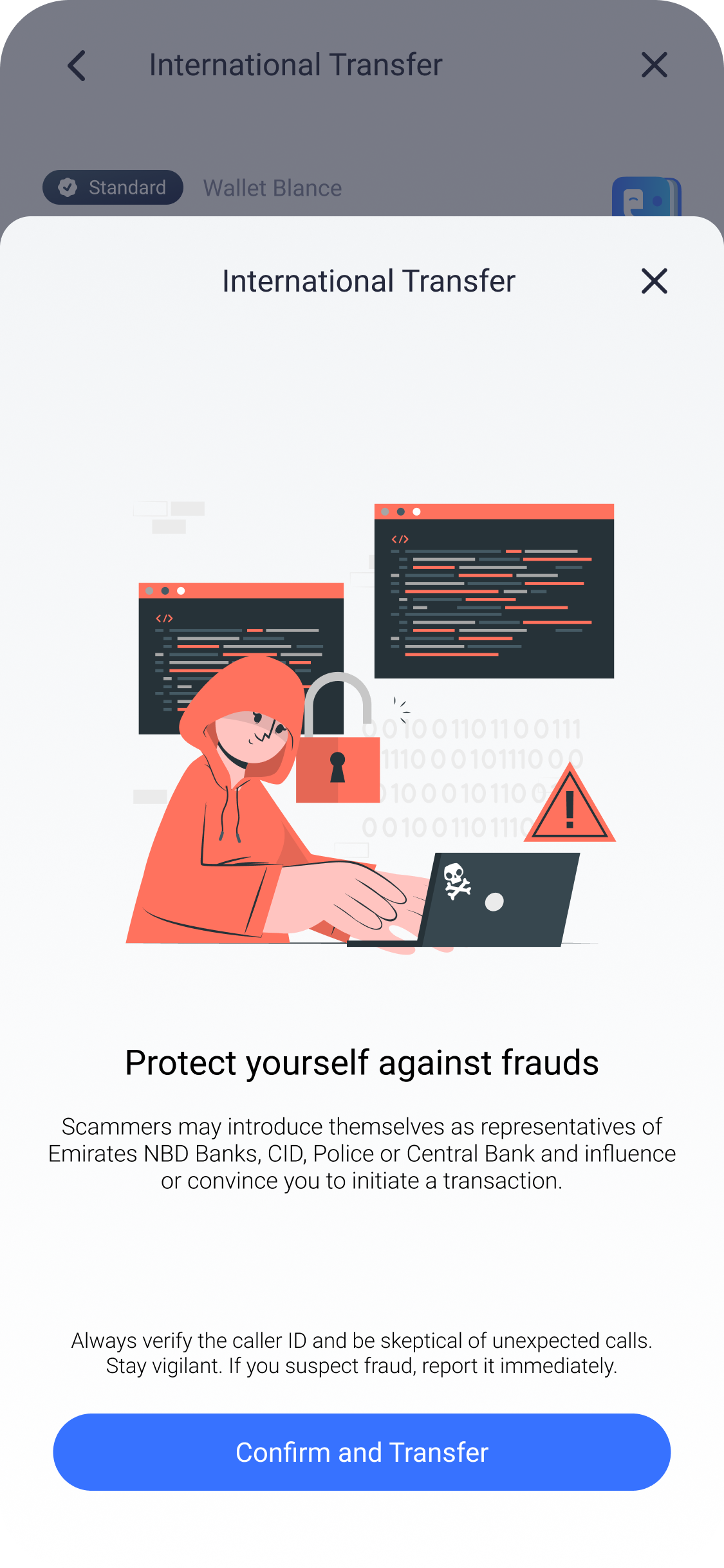
Fraud guidance
Warn people before they commit a high-risk transfer.
The warning appears near the moment of commitment, when the user can still reconsider or check the recipient. Routine parts of the product remain calm.
Fintech information hierarchy
Let users verify the transaction.
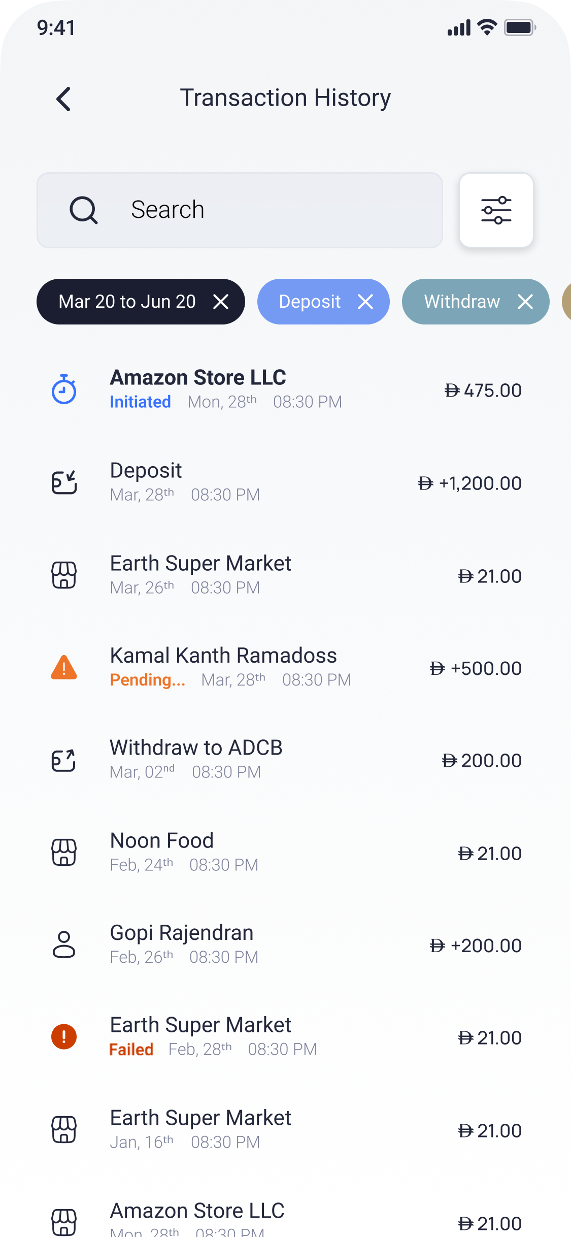
Amounts, fees, exchange rates, transaction IDs, dates, recipients and status are arranged so the user can check the outcome without searching across several screens.
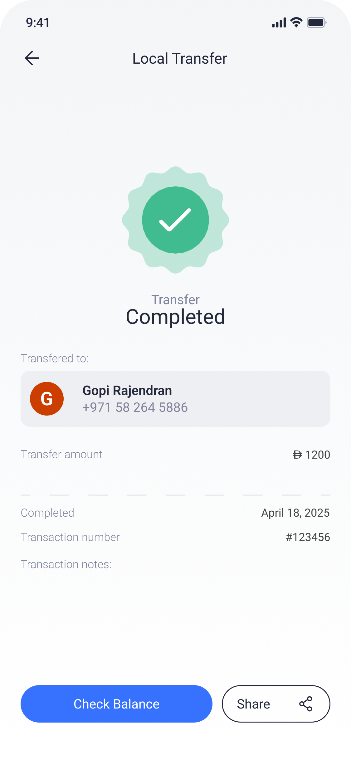
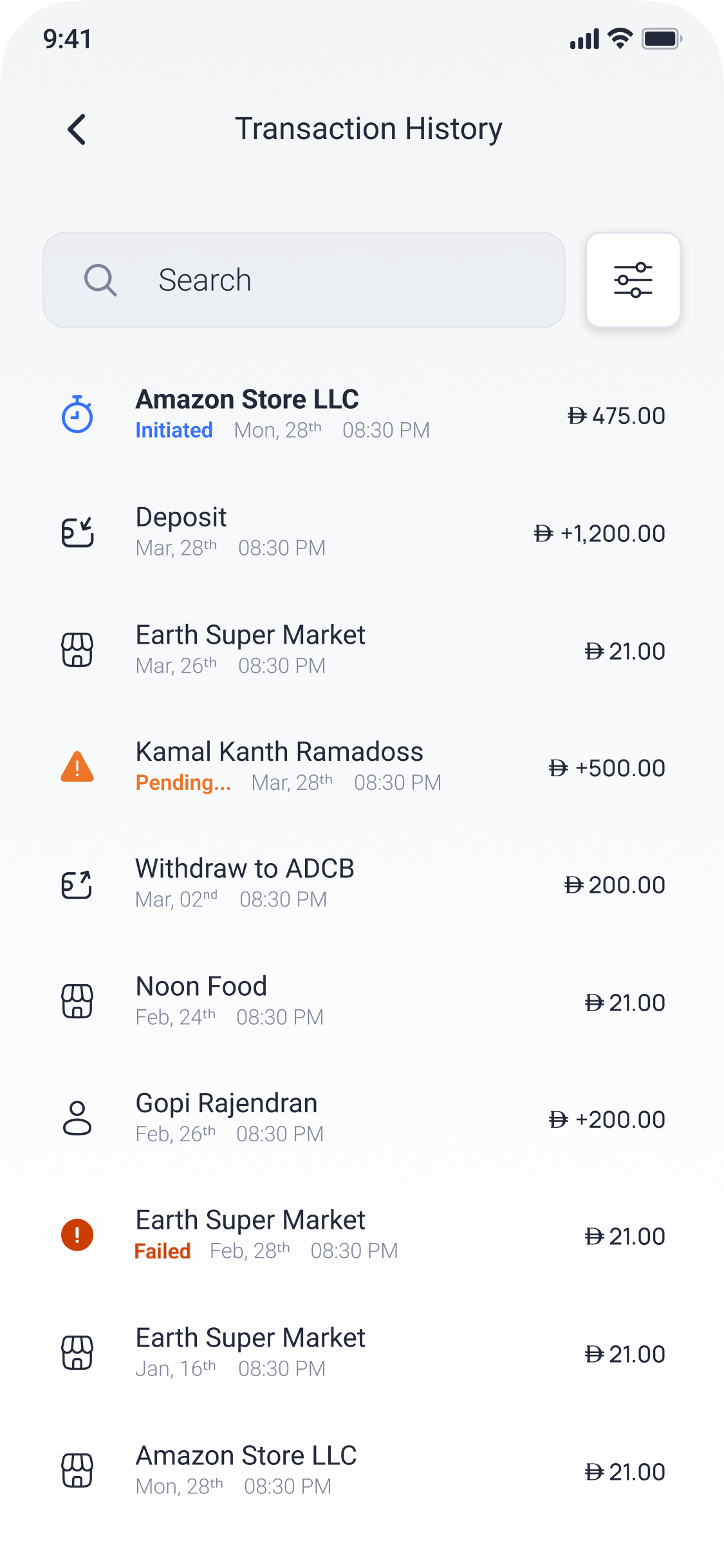
- 01Outcome + amount
- 02Recipient + destination
- 03Reference + date
- 04Shareable record
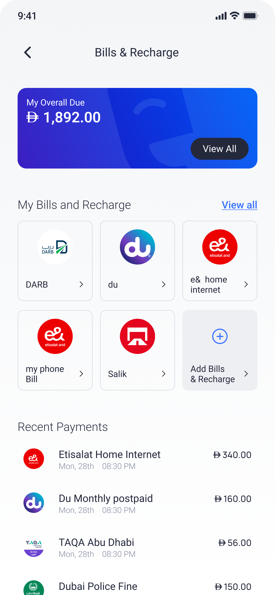
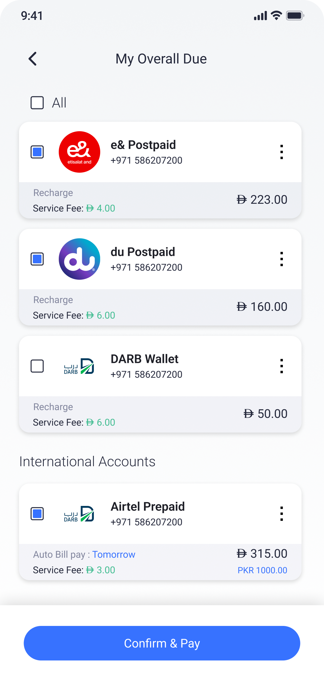
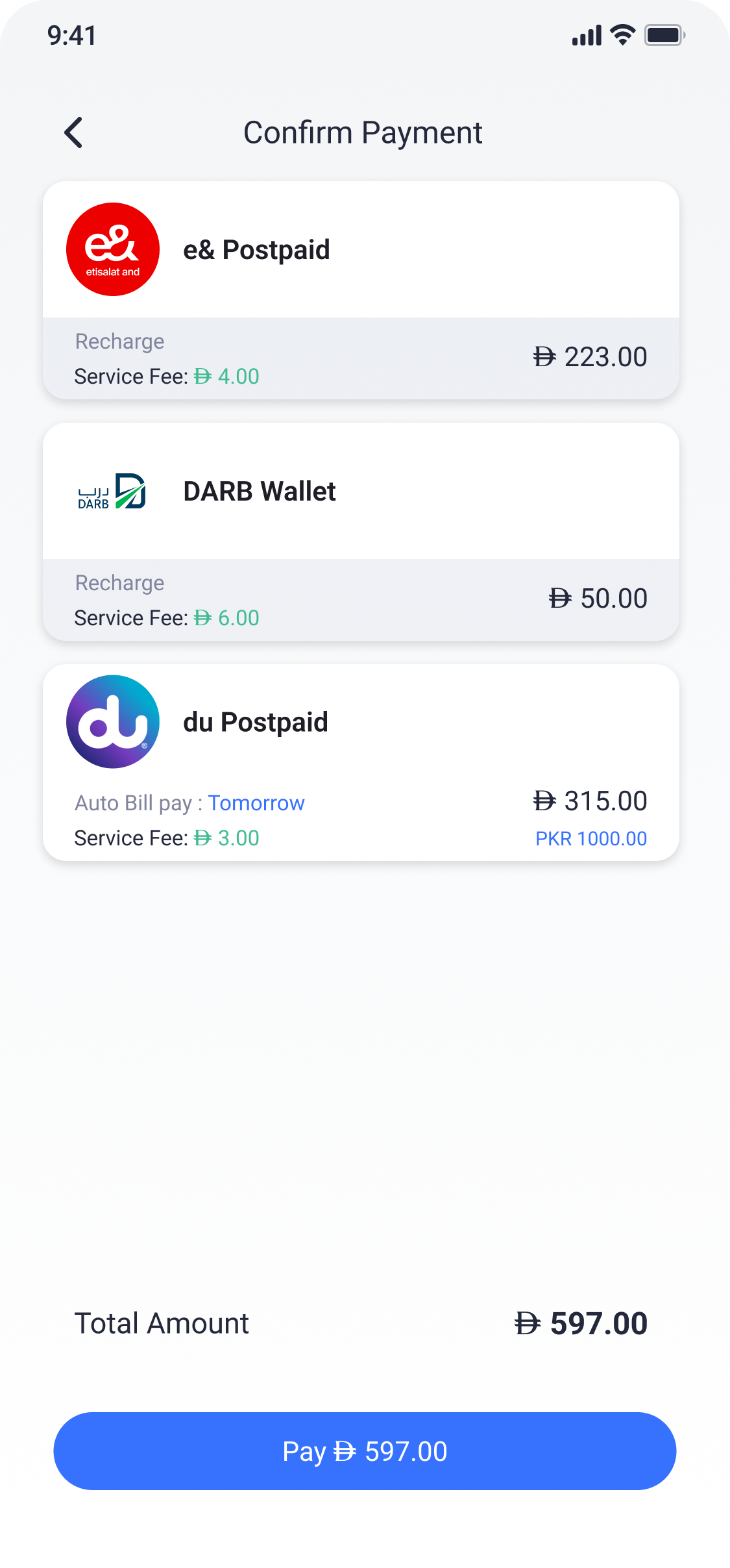
Progressive disclosure
Show detail as it becomes relevant.
Start from recognizable services and recent activity.
Reveal accounts, balances, and applicable fees.
Summarize the actual total before payment.
Content design
Copy, layout and system state were designed together.
Labels, warnings, fees and button states were written while the flows were being designed. Each piece of content explains the action or condition beside it.
Name the real state
“Processing” when work is ongoing. “Ready for pickup” only when the recipient can act.
Place words near consequence
Limits, fees, and warnings belong beside the action they affect.
Make serious actions explicit
Destructive actions should sound serious because they are serious.
Use detail as reassurance
Concrete transaction data is more useful than vague success language.
Friendly tone can coexist with unambiguous meaning.
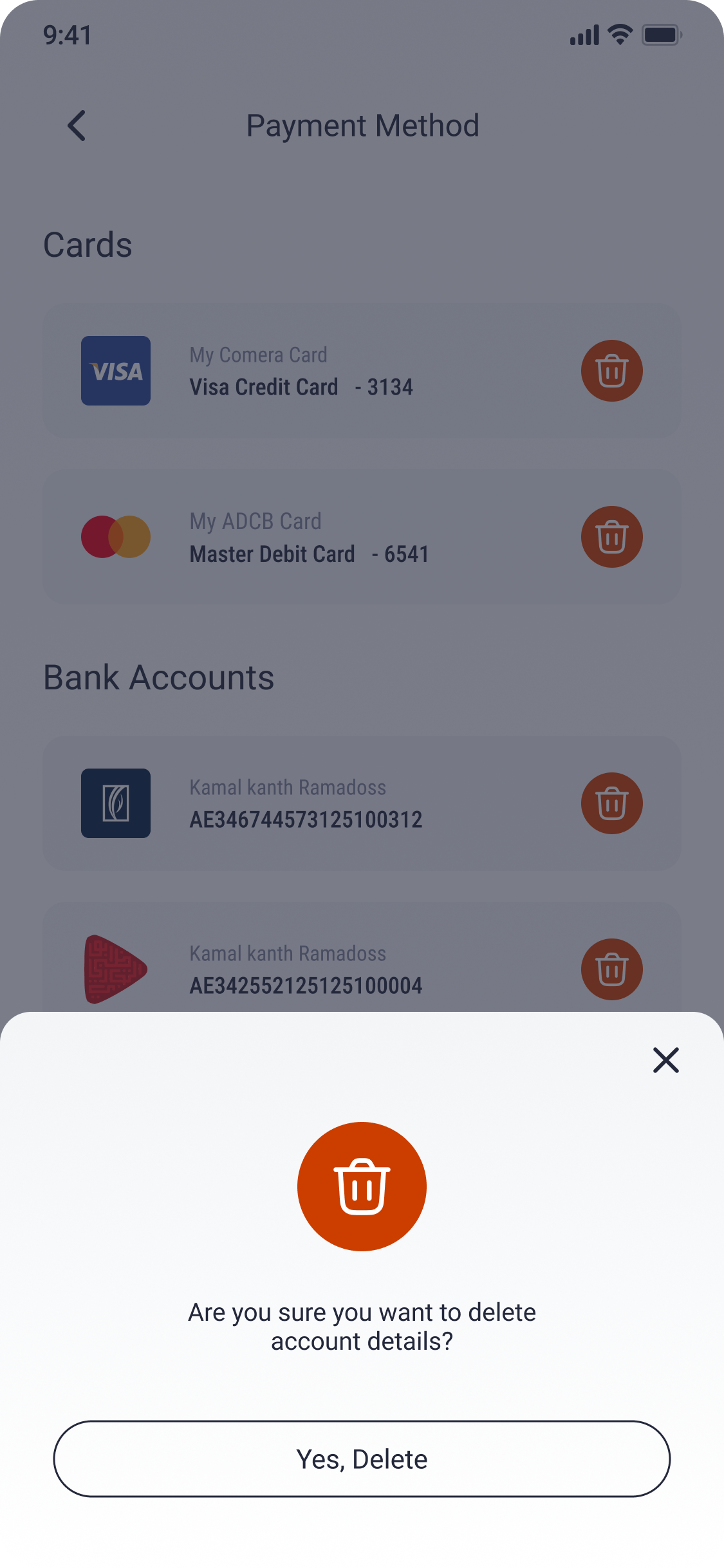
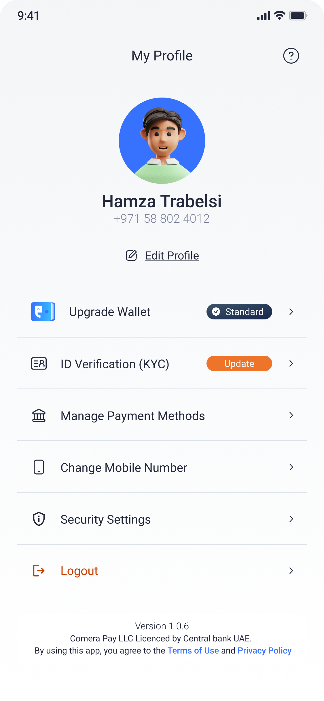
Account lifecycle
Account security develops across activation, verification and daily use.
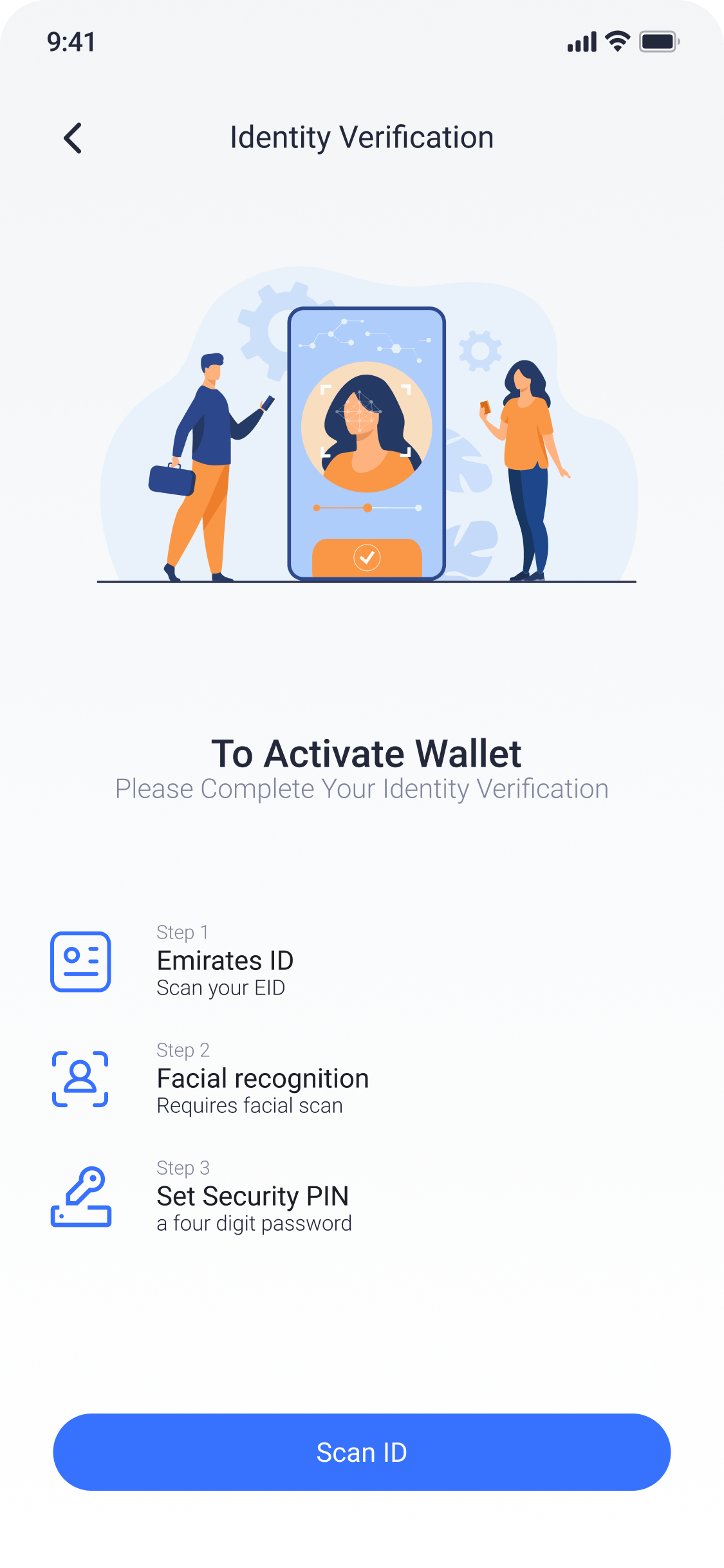
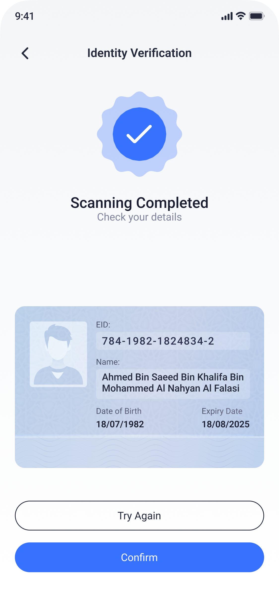
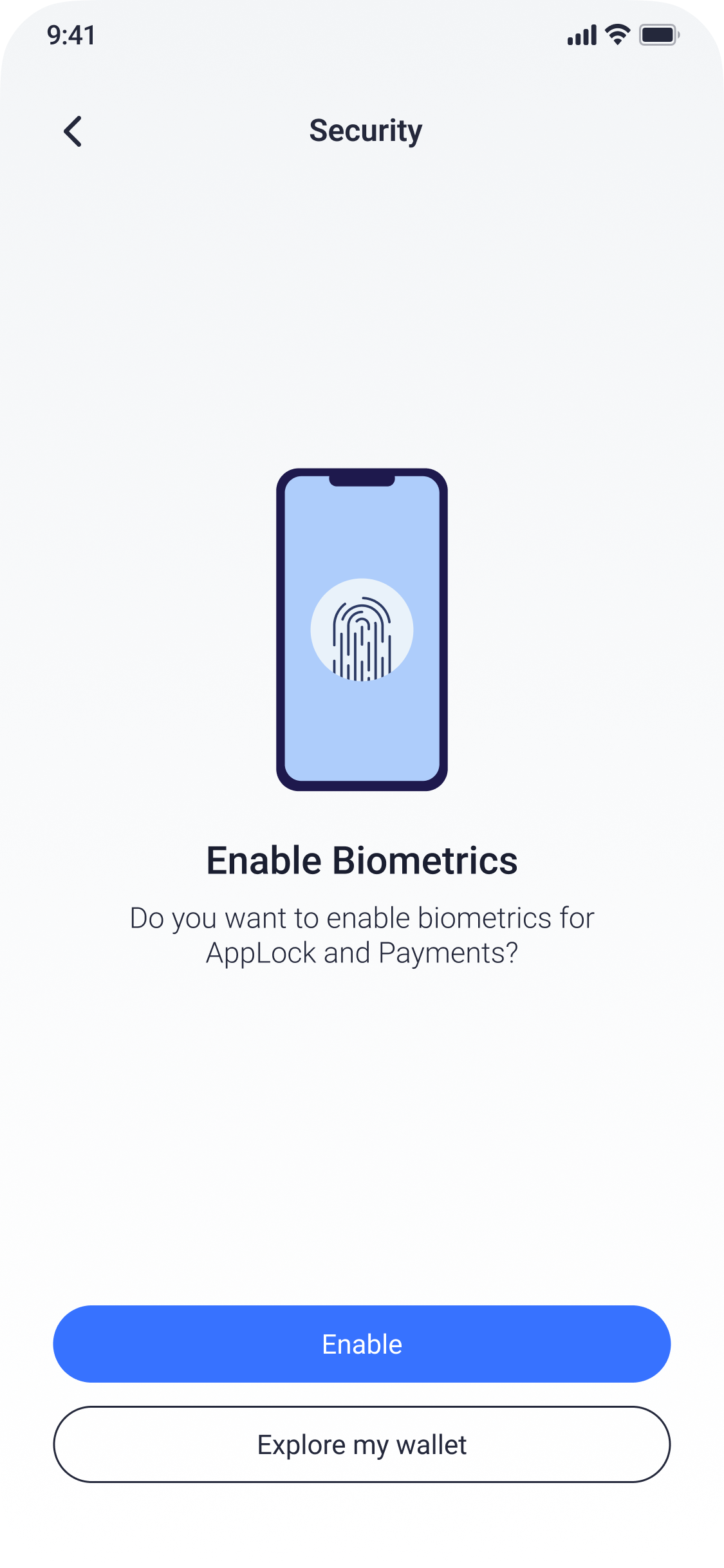
Product coverage
The system extends beyond the main transaction flows.
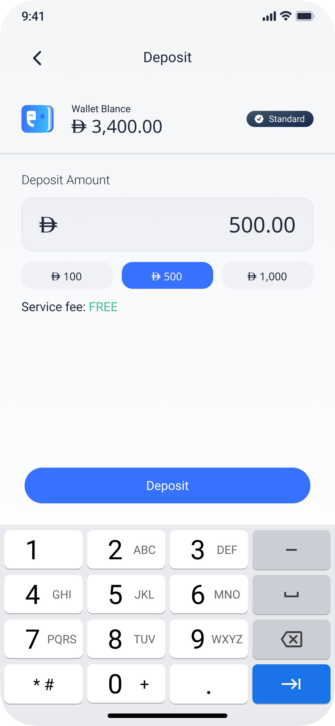
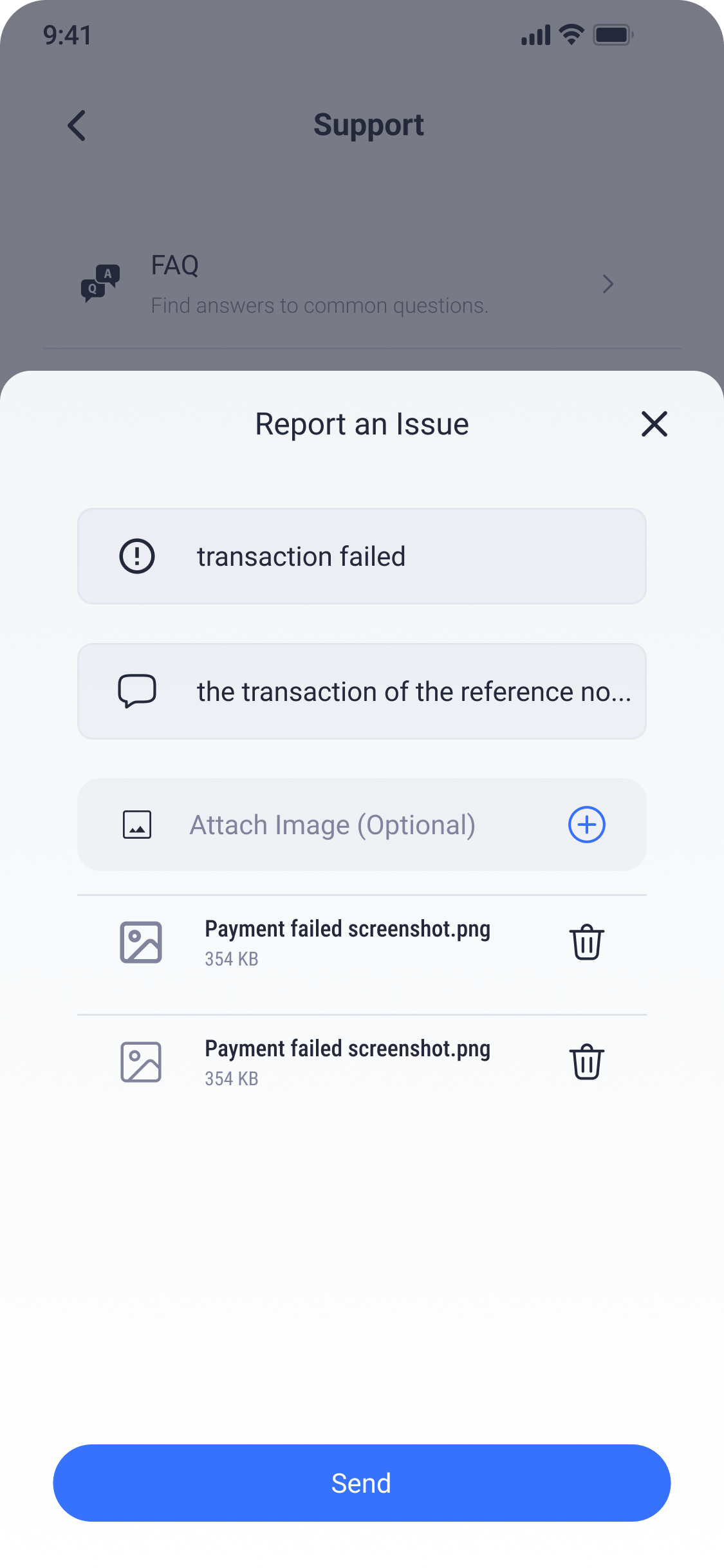
The work covers funding, withdrawal, bills, recipient management, transaction history, support, wallet tiers, identity and security, including the edge cases and operational states that connect them.
Independent ownership
I explained decisions through user intent and system rules.
I worked independently across the product, from interaction logic and UX writing to the final interface.
Design reviews focused on user intent, business rules, transaction constraints, system states and downstream consequences. Explaining decisions in those terms helped the team evaluate the experience beyond its visual treatment.

Comera Pay × TAMM
I collaborated directly with TAMM’s Product and Design teams to align flows, terminology, and interaction patterns across two established product ecosystems.
Financial products contain unavoidable detail.
The interface should present that detail when it affects a decision.
Comera Pay · Case study by Hamza Trabelsi
A wallet that explains
each transaction.
The product presents amounts, conditions, progress and recovery according to the transaction state and the decision the user needs to make.